
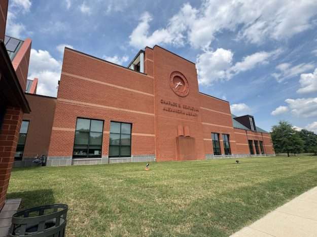
Not every city of 160,000 people commissions a nationally-recognized architect for its library, unless it’s the state capitol or largest city. Within the Commonwealth of Virginia, Alexandria is neither of these, but its proximity to the nation’s capital, its popularity among tourists, its historical importance, and—there can be no denying—its affluence have helped ensure that its flagship library is a building of some distinction, even though the structure isn’t in a part of town that most locals would call high-profile, fashionable, or even particularly central. Situated on a six-lane segment of Duke Street (State Route 236) near the western edge of town, the Charles E. Beatley, Jr Alexandria Library (usually referenced as either “Beatley Central Library” or “Beatley Branch”) has been the city’s primary location since its ribbon-cutting in 2000. Even before I ever stepped inside, I had a sneaking suspicion its design involved an architect of some significance. The above image, featuring only a fraction of the Beatley Library’s façade, barely scratches the surface: aside from the recessed clock face, it doesn’t offer any surefire giveaways of the building’s provenance.
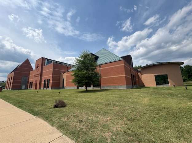
But this next photo sure does:

No matter which definition of “postmodernism” I deploy, I’m likely to face tremendous criticism from other disciples of the philosophical movement—most of them far more erudite than I am—who will tell me I’m entirely missing the point. So I’ll propose my own definition whereby “missing the point” is great deal of the point of postmodernism: its elusiveness owes much to its reaction to what precedes it, combined with its awareness of itself: an attempt to absorb virtually all previous aesthetic/social vantage points while simultaneously allowing them to nullify one another through the absence of a disinterested evaluation lens. If such a description in itself seems obscurantist and outright indulgent, perhaps the better solution is to muster some visuals, which is precisely what postmodern architecture does. As an edifice emblematic of postmodernism, the Beatley Library in Alexandria is very good. Maybe even great.
An emblem of an architectural movement
And here’s the best I can furnish of a front view from the primary parking lot. Simply put, it checks so many boxes. Modernism in architecture, encompassing a variety of forms that rose in prevalence in the second and third quarters of the 20th century, generally eschewed ornamentation by favoring a sleek simplicity that sometimes verged into austerity. Perhaps borne out of an assumption that ornamental features expedite a building’s devolution from “fashionable” to “dated” in the eyes of the general discerning public, modernism often distilled form to quadrilaterals: a gridded repetition that, in time, earned a reputation for sterility…and nonetheless dated itself. Conversely, echoing the reflexive nature of postmodern philosophy as a whole, postmodern architecture reintroduced ornamentation, color, shape, and material from a variety of time periods, with less regard for long-standing rubrics of what constitutes good or bad public taste. In the Beatley Library, postmodernism manifests itself through the pronounced, pediment-like rooflines: an aggressive contrast from the flat roofs of mid-century Prairie School architecture. Repetition isn’t absent but it’s very limited: the tall windows and steep roofs become much more striking by being few in number but greater than one; singularity cues centrality that is absent here.
The combination of starkly contested colors, nearly all of which are bolder and warmer than in a typical international style modern building, offer an equally powerful postmodern signal. The horizontal bands help relax the relentless masonry, preventing the more windowless portions—especially around the giant clock—from appearing like a fortification or prison. It’s broad-shouldered without feeling imposing. Meanwhile, the variety of geometries without any sense of favoritism provides an almost slipshod, anything-goes approach: a pastiche of schools of thought which in itself characterizes postmodernism. Although it is easy to reintroduce formerly popular artistic/cultural statements with the intent of criticizing them, the neutrality with which this building assembles all these forms, colors, and historical references almost leans toward whimsy by default.
And a powerful, semantically unique word like “whimsy” allows me to jump off my architectural critic pedestal for which I’m even more unqualified than in defining postmodernism. Feet planted firmly on the ground, I offer one final photo of the Beatley Library exterior that offers an even greater cue toward its authorship—an authorship that undoubtedly prompts those Alexandrians who care about this sort of thing to simultaneously love and hate the place. Yes, I’m finally revealing the architect for this thing!
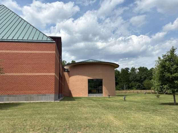
There, in the rear of the building are two features that signal the building is at least partially the work of one of the greatest champions of postmodernism in architecture: a stubby brick cylinder in an starkly different color, loosely linked to the rest of the building by those horizontal bands. The Beatley Library is at least partially an artistic effort of the famed late 20th century architect Michael Graves (1934-2015). According to records, the City recognized in the mid 1990s that the previous central library, Kate Waller Barrett Branch in Old Town, was inadequate for a growing municipality, particularly in the space allowed for library administration. (And let’s face it: that Old Town location didn’t have a lot of room for parking.) A new library on the far west side, across the street from the Cameron Station redevelopment simultaneously underway, would fulfill the spatial needs (twice the size of the Barrett Branch) and provide a major civic space in an otherwise underrepresented part of town.
Beatley Library history and stylistic evolution
The City hired Houston-based firm Pierce Goodwin Alexander & Linville, who worked in collaboration with starchitect Michael Graves, whose studio remains ensconced in Princeton, New Jersey (where he was long-term Professor of Architecture at that little school nearby). The library project, named after a former long-term city mayor, broke ground in spring of 1998, opening to the public approximately two years later. At nearly $12 million, it was the largest capital project at the time, and it became the new headquarters for the city’s six library branches. Though it appears that Graves was not the prime on this project, the Beatley Library shows enough of his signature aesthetic touches that I knew, before any research, the project bore the hallmarks of Gravesian postmodernism. I could also date it fairly accurately: within just a few years.
Already a quarter-century old, the Beatley Library is still newer than most everything else on the north side of Duke Street. But it is showing its age in two major ways. The first is that postmodern architectural aesthetics had largely peaked in popularity and were on the wane at the time this edifice opened. Though Graves and his studio remained active up to his death (and beyond), most of his highest profile works date from the 1980s and 90s. I developed a powerful awareness of Graves because we share a hometown, and Indianapolis unsurprisingly hosts a higher-than-average concentration of Graves’ work. That said, Graves’ aesthetic philosophy sought to humanize civic construction after multiple decades of what the public increasingly found to be the sterile, unforgiving mien to many elements of architectural modernism; I’ve chronicled the backlash to brutalism on multiple occasions. Several of Graves’ signature features—including a few visible here at the Beatley Library—entered the popular consciousness enough that they appeared in custom-built and even mass-produced housing in the 1990s: playful geometries, classical revivals, a short but intense love for everything teal (those pointy roofs!).
Predictably, postmodernism’s aspiration to pull from a variety of past eras helped brand its syncretism with the turn of century. Graves was even able to migrate his language to industrial design, to the point that mega-retailer Target successfully introduced the Michael Graves in 1999, while Beatley Library was under construction. This successful partnership—continuing until late 2012—not only expanded Graves’ name to a bigger audience, it helped cement Target’s brand with chic design sensibilities that were largely absent in its biggest discount superstore competitor, Walmart. Graves’ kitchenware was stylish but still affordable, two adjectives that resonate with Target up to the present. The partnership earned Graves wads of additional money—his studio still markets and innovates many of these products—but with increasing visibility came his growing association with middlebrow tastes, the anathema of “serious” architects and academics. Both postmodernism as an architectural movement and much of Graves’ oeuvre became painfully passé by the middle of the aughts. I can recall graduate design school faculty—Graves’ colleagues—referring to his output in his sunset years as “architectural abominations”. But then, many critics said the same about The Portland Building, his first work to achieve international recognition.
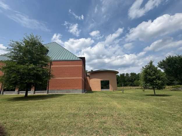
All too often, artistic movements migrate across various tiers in Pierre Bourdieu’s “echelons of taste”, and postmodernism is no different. The backlash it faced in the late 2000s helped spawn a more recent reassessment and rehabilitation that has undoubtedly helped the Michael Graves studio endure after his death and the termination of the partnership with Target. I don’t think most Alexandrians have a big problem with the Beatley Library. That said, an immobile structure like a building must still reconcile itself to changing cultural forces: specifically, how people use library services and materials. What is the point of that standalone cylindrical room in the back?
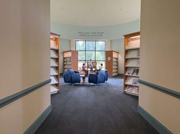
Library interior: the signature room is nearly obsolete
The most Gravesian feature in the Beatley Library is a periodical room. In the late 1990s, when the firm PGAL and Graves studio collaborated to conceive of this new temple of books for Alexandria, magazines and newspapers still commanded huge numbers in circulation. Bookstores had massive wings devoted to magazines, news racks were filled daily and generated solid revenue, and even book-haters could enjoy pulling out a magazine and curling up on a comfy chair to read and doze. But what does a periodical room in a library look like in 2026?

It’s still a distinctive space, and those big windows allow copious amounts of natural sunlight. But the room doesn’t seem to do a lot.
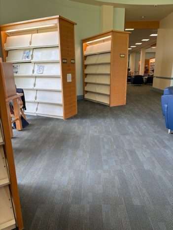
It’s easy to imagine these shelves filled with the latest issue of a variety of publications, both commonplace and obscure. And then one could lift open the display rack and find back issues in laminate stacked on a shelf.
Those days are over. Magazines that, in 1999, boasted subscriptions in the millions have ceased all publication, lost largely due to the inability for print-based media cultures to recalibrate advertising/subscription revenue to the age of the internet, where free-ranging grazing on widely available info has long reigned supreme. Who needs static print news when the latest scores can get updated twice a minute online? Even though the Internet has enjoyed widespread access since the mid 1990s, the decline of the ‘zine was a slow ebb. Magazines with overall a million subscribers like Sports Illustrated—which peaked in popularity during the same decade Michael Graves made a name for himself—had to scale back from weekly issues to biweekly, then monthly. It is now vestigial in print, which places it in a better position than most. Those of us who receive magazines from professional associations or as university of alumni have seen a similar retreat: a hundred-page monthly publication in 2006 is now quarterly at forty pages. The digital takeover helps save paper and trees, but renders huge subsections of print media obsolete. And, if the William J. Birchler Periodical Room is any evidence, the Beatley Library hasn’t yet devised a better plan for this unique space.
How does the rest of Michael Graves’ interior stand up?
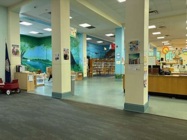
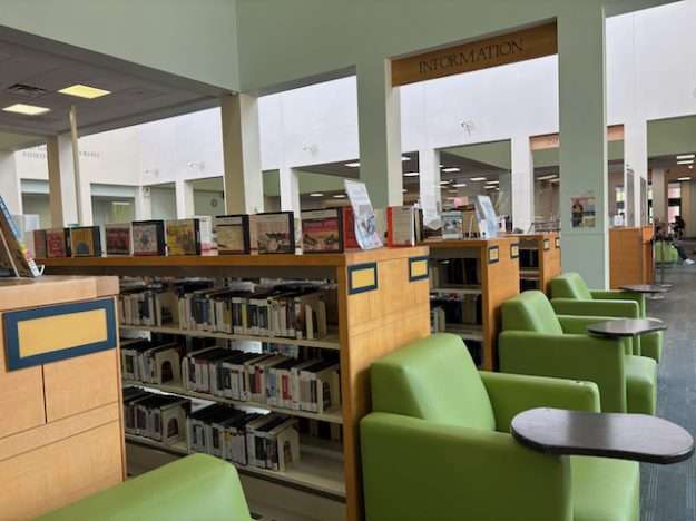
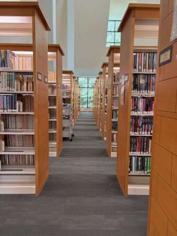
The 60,000-square-foot facility isn’t exactly packed-to-the-gills with books, nor does it seem that busy on a sunny summer Friday afternoon, but it would be unfair to call it underutilized like the cylindrical room. The Beatley Library, as the City’s flagship, still offers copious books in its collection—something not always common in the smaller branch libraries in large cities. An upper level, closed off to the public, hosts additional administrative offices that serve all six of the city’s branches. In an era of downloadable books and e-readers, enough people still prefer the act of turning pages to help sustain the municipal library. Perhaps book collections are enjoying a mini-comeback—akin to the renewed sympathy for postmodern architecture—as people revolt against virtually every other medium going digital. The bankruptcy of Borders Books in 2011 prompted a self-assessment from other booksellers, independent and corporate and not named “Amazon”, to the point that both the niche mom-and-pops and Barnes & Noble are more prevalent than ever.
There’s hope yet for late twentieth century fads. Alexandrians, find a space in your local library’s truncated silo, and relax with one of the thirty periodicals still in print. Or, stay at home with your Kindle or Nook, where you can read and enjoy a cup of tea from your suspicious-looking Michael Graves kettle. Much like the intense Austrian painter, we all have a kampf-y chair.

20 thoughts on “Beatley Library: is lounging with a magazine in 2026 what we call “post-postmodern”?”
Michael Graves is my dad’s favorite. (Dad is a retired architect.)
LOL @ “that little school nearby”. Perfect.
Also, Graves is not particularly well represented in his hometown. His designs here include the Indianapolis Art Center, a sprawling low-rise complex at the north edge of Broad Ripple Village, and the former RCA-Thomson Consumer Electronics Division HQ, a sprawling suburban office complex (2 similarly clad office buildings) in suburban Carmel.
I concede: three projects isn’t a lot. The best known is probably NCAA Hall of Champions. But he’s well represented in his home state as a whole, albeit it through a fair number of private commissions for residences, including one in Fort Wayne that was torn down I believe.
Not sure there’s a place where he’s hugely well represented, aside from perhaps his adopted city of Princeton, NJ. And he seems to have a fair amount in DC, but since the GSA routinely commissions starchitects to design the federal portfolio, I’m not sure if Graves is better represented there than his peers. But the DOT headquarters is awfully high profile.
So having three projects still probably makes Indy better represented with his work than many comparable cities of its size.
Nothing that I can find in Columbus, IN incidentally.
I totally spaced on the NCAA Hall. Mainly because its not so obviously his style. The facade totally overshadows/overwhelms the Gravesian body of the building and is so derivative of stadia from 100 years ago (Franklin Field and Harvard Stadium come to mind).
For Graves’s detractors, the word “derivative” (used pejoratively) is what makes this building and so many others so Gravesian.
You nailed me. 🙂
True of the NCAA Hall, but not of the other two buildings in Indy. And I agree, true of the Beasley Library.
The building is certainly more attractive than the brutalist monstrosities of the 60s and 70s, but the words I would have to use to describe it is “overwhelmingly boring.” Sad because there’s otherwise a lot of nice historic architecture in Alexandria.
I’d quibble some. Not all Modern/Brutalist libraries are monstrous.
Look up the 1969 Cleo Rogers Memorial Library in Columbus, Indiana, designed by I.M. Pei. Its massing, entry, flat roof, lack of ornamentation, and fenestration are in the manner of Modern/Brutalist design despite being brick.
The key Brutalist elements are inside: exposed concrete walls and lintels, plus Interior ceilings use a style of large square smooth-finish coffered concrete block similar to the WMATA station vaults designed a few years later by Harry Weese. (who was also active designing similar brick/concrete churches and schools in Columbus Indiana in the 1960s).
The Beatley Library is comparatively restrained–not quite the candy-colored funhouse architecture of Graves at his most unrestrained. I’d guess that Alexandria didn’t want too many “loud” features, because I’d imagine that the more attuned among the library committee already knew even in the late 1990s that Graves’s most eccentric designs were looking very much of their period. Case in point: the very iconoclastic Portland Building (1982, his first world-famous work) underwent a massive reconstruction a few years ago that threatened its NRHP classification. Comparatively the Humana Building in Louisville (1985) hasn’t elicited nearly the polarizing responses. Though Humana vacated a few years ago (now a hotel, I think) the building has retained its high standing. Admittedly though, Humana’s aesthetic became so popular in the late 80s/early 90s that I believe there are many lesser imitators…and this ubiquity makes Humana seem far less radical today.
I have to second Chris’s take on Brutalism. Many brutalist banks have faced the wrecking ball and not a tear was shed, and my own university’s battlestar libraria was brilliant for its interior organization but nobody loved the space itself. That said, I think that, much as we deride Boston City Hall (not a library I know), we would miss it if or when it goes away.
Looks like a detention center
So, we’re in a local mall (Crossroads Bellevue, one you should visit!). As I’m reading about the periodical room, Mike comments, “You know, there used to be a newsstand right here.”
The obsolescence of certain media types forces retailers and service providers to rethink their space.
Case in point: this Graves-designed library devoted the most interesting room to periodicals. It has circular walls! People still go there to read and study, but in terms of library content, it’s basically empty. Definitely underutilized.
Reply
This and the Kingstowne Library were my most favorite places to go as a kid!
More trees, gardens, shade, benches, flowers, and invitations to walk are needed.
Good observation. To be fair, my photos don’t capture very much of the primary entrance, which is on the west side of the building directly facing the library’s parking lot. That side is nicely landscaped, and the parking lot has abundant shade trees.
But the oblong side visible in most of these photos is what directly looks out onto Duke Street, the main arterial. So cars traveling in both directions can easily see it, and you’re right that it is very austere.
They decided to devote their entire landscaping budget to the side with the parking lot, while every other angle looks institutional.
Michael Graves was so talented, so prolific…in architecture…then designing home goods at Target…even medical equipment! I saw a wheelchair he designed at a hospital in Florida. As Alexandrians we should def be proud of our library! ❤️
I love magazines and subscribe to several.
I just counted seven magazines that I receive, none through overt subscriptions–all through either professional association affiliations or alumni clubs. Occasionally I dive into one. But I have definitely noticed they’ve gotten much, much thinner. And magazines that were monthly in 2016 are quarterly today.